How Effective is the combination of your Main Product and Ancillary Texts?
As a group we established
that our products needed to become a brand and therefore a theme running
through them would create this brand. We decided that creating an iconic image
within Harvey would achieve a clear link between our products.
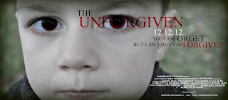
Within our poster the audiences’ eye is immediately drawn to the close up image of Harvey’s face and this initialises the link running through the products that we have created. This image of Harvey is also seen in the webpage as the page opens with shots of Harvey on a swing along with statistics being typed onscreen, which is also seen in the trailer. Typography is also a running theme in our products as we have used the same font throughout. We used a typewriter style font to create a police report style. We were inspired by films such as ‘gone baby gone’ in which a typewriter font was used to emphasise the theme of missing children. In our typography we also created an image to replace the ‘o’ in our typography which gives connotations of the devil and possession. By doing this we have also linked the typography throughout all of our products.

By using the certification ‘tbc’ on our poster we have linked back to the trailer and film as it contains clips and images that would not be suitable for a younger audience. The reason for using ‘tbc’ or ‘to be confirmed’ is that the trailer itself could be rated a 15, however the theme of the film could lead to more gory or graphic shots.

 Our trailer, poster and
webpage all conform to codes and conventions of the psychological horror genre.
They all use the image of a small boy who initially creates a feel of innocence
and gains the trust of the audience but turns out to be possessed. This is seen
in the poster through the editing of the red eyes and the paler skin tone. On
the webpage it is shown through the fast shots that are shown before the
audience are directed to the webpage. In the trailer we have shots such as the
shot of the knife being thrown to the ground, and the shot of the flames which
conform to the genre.
If we were to complete the project with more money and time, we would aim to create better advertising by creating a viral campaign. We thought that by creating a pop-up of Harvey's face to put online, we could further the branding of our products. As well as this we thought that advertising on social networking sites such as Facebook and Twitter would make the film known to our target audience of over 15's. This would mean our brand could be better known and gain more followers.
 When comparing our products to one of the films that inspired us, 'The Omen', we found that there were a lot of similarities and this meant we could confirm that we have followed codes and conventions of the psychological horror genre.
Our poster is similar to 'The Omen' poster as both use a close-up of the main protagonist as the main focus point. Both posters have a sense of evil to them as the young boy in both is staring straight into the camera which makes the audience feel uneasy and that they are involved in the poster.

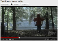
The two trailers have similarities as they both feature a swing which has references and connotations to youth and innocence.

If we to create a theatrical trailer for 'The Unforgiven' as oppose to a teaser trailer we would create a clearer narrative and give the audience more of an idea as to what will happen in the actual film. The trailer would probably have less fast, straight cuts and would focus more on narrative than the teaser trailer does.
Within our poster the audiences’ eye is immediately drawn to the close up image of Harvey’s face and this initialises the link running through the products that we have created. This image of Harvey is also seen in the webpage as the page opens with shots of Harvey on a swing along with statistics being typed onscreen, which is also seen in the trailer. Typography is also a running theme in our products as we have used the same font throughout. We used a typewriter style font to create a police report style. We were inspired by films such as ‘gone baby gone’ in which a typewriter font was used to emphasise the theme of missing children. In our typography we also created an image to replace the ‘o’ in our typography which gives connotations of the devil and possession. By doing this we have also linked the typography throughout all of our products.

By using the certification ‘tbc’ on our poster we have linked back to the trailer and film as it contains clips and images that would not be suitable for a younger audience. The reason for using ‘tbc’ or ‘to be confirmed’ is that the trailer itself could be rated a 15, however the theme of the film could lead to more gory or graphic shots.
 Our trailer, poster and
webpage all conform to codes and conventions of the psychological horror genre.
They all use the image of a small boy who initially creates a feel of innocence
and gains the trust of the audience but turns out to be possessed. This is seen
in the poster through the editing of the red eyes and the paler skin tone. On
the webpage it is shown through the fast shots that are shown before the
audience are directed to the webpage. In the trailer we have shots such as the
shot of the knife being thrown to the ground, and the shot of the flames which
conform to the genre.
Our trailer, poster and
webpage all conform to codes and conventions of the psychological horror genre.
They all use the image of a small boy who initially creates a feel of innocence
and gains the trust of the audience but turns out to be possessed. This is seen
in the poster through the editing of the red eyes and the paler skin tone. On
the webpage it is shown through the fast shots that are shown before the
audience are directed to the webpage. In the trailer we have shots such as the
shot of the knife being thrown to the ground, and the shot of the flames which
conform to the genre.If we were to complete the project with more money and time, we would aim to create better advertising by creating a viral campaign. We thought that by creating a pop-up of Harvey's face to put online, we could further the branding of our products. As well as this we thought that advertising on social networking sites such as Facebook and Twitter would make the film known to our target audience of over 15's. This would mean our brand could be better known and gain more followers.
 When comparing our products to one of the films that inspired us, 'The Omen', we found that there were a lot of similarities and this meant we could confirm that we have followed codes and conventions of the psychological horror genre.
 Our poster is similar to 'The Omen' poster as both use a close-up of the main protagonist as the main focus point. Both posters have a sense of evil to them as the young boy in both is staring straight into the camera which makes the audience feel uneasy and that they are involved in the poster.

The two trailers have similarities as they both feature a swing which has references and connotations to youth and innocence.

If we to create a theatrical trailer for 'The Unforgiven' as oppose to a teaser trailer we would create a clearer narrative and give the audience more of an idea as to what will happen in the actual film. The trailer would probably have less fast, straight cuts and would focus more on narrative than the teaser trailer does.


No comments:
Post a Comment