Monday, 26 March 2012
The Unforgiven Webpage
http://www.wix.com/251121/actualactualactualwebpage
This is the link to our webpage - we have created our webpage in order to show the possessed side of the bo.y
Labels:
Final Webpage,
harvey,
the unforgiven
Saturday, 24 March 2012
Evaluation Question 4
RESEARCH & PLANNING
We used media technologies during the whole process of our coursework, varying on the task we were completing.
We used YouTube frequently to enable us to not only carry out our research into genre, which really helped towards inspiration, but also when posting our final teaser trailer to gain our own feedback and compare our trailer to what we had previously been inspired by. This enabled us to see whether or not we were challenging or conforming to the codes and conventions of our genre.

Survey Monkey played a huge role when we needed to find out what the audience would want from the type of film trailer we wanted to create. We were able to discover the thoughts from the audience we were looking for to help with our ideas for our trailer.
When planning our teaser trailer, we had many thoughts and ideas about where our location for shots such as the swing shot could be, we therefore often used GoogleMaps to decide on the best location. It would be decided on factors such as whether it was easily accessible, whether one of us lived near by or whether the swing actually looked effective after we had put it on a tree.
 When researching for typography for our trailer and ancillary tasks, we used the website 'DaFont'. This was so we could pick a font that would suit our genre. We eventually went for a simple typewriter font. This was because it gives the impression of a news case, or missing child case which was ideal for our ideas.
CONSTRUCTION
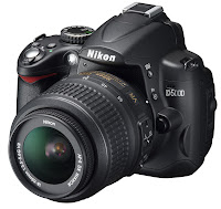 When filming our teaser trailer, we used the camera Nikon D5000. Not only was this beneficial for us because we were able to shoot in a high quality that would look effective, but we were also able to use it to take our photographs for our blog, webpage and our poster.
Not only did we use a good camera, we also used a iPhone. This was so that we could create a 'homevideo' effect, making sure the shots werent staged and looked as realistic as possible.
Whilst editing, we used many programmes to carry out our tasks, with the most important being iMovie. iMovie played a massive role when conducting our teaser trailer. We were able to add many effects, such as text on shots to make them seem even more home video, and even better than doing it from a real video camera as we could pick specific dates which were beneficial to us.
We were then able to also use blank screens to show the progress of time or even having flashbacks. Accompanying much of this was TV noise which made the home video shots more realistic.
To use our typewriter effect, we used Microsoft PowerPoint to do so. We added the typewriter effect to our text, then used the screen recording on Quicktime to then put it onto iMovie for our trailer. This was the quickest, easiest and most successful way of getting our text to appear like it is being typed.
 When getting videos of things such as our idents or even bits of music, we used many YouTube converters. This meant that our trailer could seem more realistic as we were able to research into idents used in films for the same, or similar genres.
We downloaded music off youtube and other sites such as Soundcloud. We had to overlap and delete or add sections to the pieces, we did this on Garageband. This was so that the sound would specifically fit our trailer and build tension when necessary. We also used Garageband to increase or decrease the tempo.
POSTER
 when creating our poster, we used the camera to take the shots, and later uploaded them to iPhoto. This then enabled us to work our way through the many photographs we took to find the best ones that would work well as a poster for our film.
 We initially used Photoshop to work on our layering of photographs when designing and thinking of our ideas.
 We tried effects on the photograph of the young boy to make him looked possessed, which we really struggled with. Eventually we came up with the idea of putting red rings round his iris. this happened to be successful, later leading to us using one of the eyes as the letter 'o' in the title of The Unforgiven.
We returned to Photoshop to do the professional looking editing to the poster, such as the credits at the bottom and making sure the brightness and contrast were correct.
WEBPAGE
 During the process of creating our webpage, we used the website 'Wix'. This enabled us to start from a blank design to make it however we wanted.
Originally, we would have liked to have a simple website with a moving swing in the background by using a gif image. This ended up being unsuccessful and bad quality. So we resorted to using an opening to our webpage which would then lead to a simple page, showing our trailer and having buttons linking to popular social networking sites.
The opening of our webpage was created using iMovie.
EVALUATION
 once completing our teaser trailer and ancillary tasks, our job was to get our pieces to our chosen audience. As social networking sites are so popular, it was the best place for us to start. We opened Twitter, Facebook, Flickr and YouTube accounts to get our work out.
 Having all these accounts has enabled us to get feedback on our work, allowing us to then develop not only our ideas but our work further.
We use Twitter to keep our followers up to date on what we are doing next, We use Facebook to promote our work, letting them like what they see, and Flickr gave us the opportunity to post photographs of our filming and our poster ideas etc.
Labels:
Evaluation Question 4
Evaluation Question 3
What have you learned from your audience feedback?
Audience feedback is a crucial aspect of our teaser trailer, as it is through the viewer’s prospective we identify what has gone well when producing our trailer and what may have not worked as successfully.
Media Screening
There was a media screening held at school which allowed us to have a variety of different people viewing our teaser trailer. We had evaluation sheets which were handed out and answered about the trailer. The results that we got helped us to understand what the audience interpret about our trailer and which elements where the most successful, and maybe some elements that did not work as well.
The questions that we asked were: What genre do you think our teaser trailer is? from the answers we found that everybody put horror as the main genre, with 4/10 people breaking it down further into the supernatural sub genre. This shows that our trailer fits to the codes and conventions of a horror trailer as everybody was able to identify it.
The questions that we asked were: What genre do you think our teaser trailer is? from the answers we found that everybody put horror as the main genre, with 4/10 people breaking it down further into the supernatural sub genre. This shows that our trailer fits to the codes and conventions of a horror trailer as everybody was able to identify it.
The next question that we asked was: How well do you think the trailer fits the intended genre? 3/10 of the feedback forms we got back said that the trailer fits the intended genre 'perfectly' with the other 7 saying that it fits 'very well'.
The next question was: Who do you think the target audience is for the teaser trailer? 100% of our feedback came back as 'teenagers' as our target audience, which is correct but more specifically it is 15+.
The last question asked was: What was the most memorable moment in the teaser trailer for you? we had a variety of answers from this questions, ranging from the 'child singing' to the most popular of 'the ending when the child opens his eyes'.
Facebook Feedback
We created a Facebook account in order to gain feedback from our target audience of 15 year olds and above. We were able to share the video to different pages to circulate the trailer online to gain as much feedback as possible.
Twitter Feedback
We also made a twitter account and tweeted our trailer to others as again this is a prime social networking site for our target audience and is an easy way of getting our trailer viewed by others.
YouTube Feedback
 We posted our trailer to YouTube which enabled it to be viewed by anybody around the world. People are able to ‘like’ the trailer and also able to leave comments below. YouTube also allows us to gain other statistical information about the people who have viewed our trailer. From this we have found that 55.2% of our views have come from females and the video is most popular with those aged between 18 - 24 which shows we are appealing to our target audience.
We also posted our first draft of our teaser trailer onto YouTube in order understand if what we had been doing appealed to our target audience. We asked some people what they thought of it and from this we found that we needed to change the order of the trailer so that it was not in chronological order, we needed to add more fast paced editing to build tension and also work on the music so that it was more subtle to contrast our powerful images.
Labels:
Evaluation Question 3
Evaluation Question 2
How Effective is the combination of your Main Product and Ancillary Texts?
As a group we established
that our products needed to become a brand and therefore a theme running
through them would create this brand. We decided that creating an iconic image
within Harvey would achieve a clear link between our products.
Within our poster the audiences’ eye is immediately drawn to the close up image of Harvey’s face and this initialises the link running through the products that we have created. This image of Harvey is also seen in the webpage as the page opens with shots of Harvey on a swing along with statistics being typed onscreen, which is also seen in the trailer. Typography is also a running theme in our products as we have used the same font throughout. We used a typewriter style font to create a police report style. We were inspired by films such as ‘gone baby gone’ in which a typewriter font was used to emphasise the theme of missing children. In our typography we also created an image to replace the ‘o’ in our typography which gives connotations of the devil and possession. By doing this we have also linked the typography throughout all of our products.

By using the certification ‘tbc’ on our poster we have linked back to the trailer and film as it contains clips and images that would not be suitable for a younger audience. The reason for using ‘tbc’ or ‘to be confirmed’ is that the trailer itself could be rated a 15, however the theme of the film could lead to more gory or graphic shots.

 Our trailer, poster and
webpage all conform to codes and conventions of the psychological horror genre.
They all use the image of a small boy who initially creates a feel of innocence
and gains the trust of the audience but turns out to be possessed. This is seen
in the poster through the editing of the red eyes and the paler skin tone. On
the webpage it is shown through the fast shots that are shown before the
audience are directed to the webpage. In the trailer we have shots such as the
shot of the knife being thrown to the ground, and the shot of the flames which
conform to the genre.
If we were to complete the project with more money and time, we would aim to create better advertising by creating a viral campaign. We thought that by creating a pop-up of Harvey's face to put online, we could further the branding of our products. As well as this we thought that advertising on social networking sites such as Facebook and Twitter would make the film known to our target audience of over 15's. This would mean our brand could be better known and gain more followers.
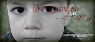 When comparing our products to one of the films that inspired us, 'The Omen', we found that there were a lot of similarities and this meant we could confirm that we have followed codes and conventions of the psychological horror genre.
Our poster is similar to 'The Omen' poster as both use a close-up of the main protagonist as the main focus point. Both posters have a sense of evil to them as the young boy in both is staring straight into the camera which makes the audience feel uneasy and that they are involved in the poster.
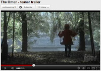
The two trailers have similarities as they both feature a swing which has references and connotations to youth and innocence.

If we to create a theatrical trailer for 'The Unforgiven' as oppose to a teaser trailer we would create a clearer narrative and give the audience more of an idea as to what will happen in the actual film. The trailer would probably have less fast, straight cuts and would focus more on narrative than the teaser trailer does.
Within our poster the audiences’ eye is immediately drawn to the close up image of Harvey’s face and this initialises the link running through the products that we have created. This image of Harvey is also seen in the webpage as the page opens with shots of Harvey on a swing along with statistics being typed onscreen, which is also seen in the trailer. Typography is also a running theme in our products as we have used the same font throughout. We used a typewriter style font to create a police report style. We were inspired by films such as ‘gone baby gone’ in which a typewriter font was used to emphasise the theme of missing children. In our typography we also created an image to replace the ‘o’ in our typography which gives connotations of the devil and possession. By doing this we have also linked the typography throughout all of our products.

By using the certification ‘tbc’ on our poster we have linked back to the trailer and film as it contains clips and images that would not be suitable for a younger audience. The reason for using ‘tbc’ or ‘to be confirmed’ is that the trailer itself could be rated a 15, however the theme of the film could lead to more gory or graphic shots.
 Our trailer, poster and
webpage all conform to codes and conventions of the psychological horror genre.
They all use the image of a small boy who initially creates a feel of innocence
and gains the trust of the audience but turns out to be possessed. This is seen
in the poster through the editing of the red eyes and the paler skin tone. On
the webpage it is shown through the fast shots that are shown before the
audience are directed to the webpage. In the trailer we have shots such as the
shot of the knife being thrown to the ground, and the shot of the flames which
conform to the genre.
Our trailer, poster and
webpage all conform to codes and conventions of the psychological horror genre.
They all use the image of a small boy who initially creates a feel of innocence
and gains the trust of the audience but turns out to be possessed. This is seen
in the poster through the editing of the red eyes and the paler skin tone. On
the webpage it is shown through the fast shots that are shown before the
audience are directed to the webpage. In the trailer we have shots such as the
shot of the knife being thrown to the ground, and the shot of the flames which
conform to the genre.If we were to complete the project with more money and time, we would aim to create better advertising by creating a viral campaign. We thought that by creating a pop-up of Harvey's face to put online, we could further the branding of our products. As well as this we thought that advertising on social networking sites such as Facebook and Twitter would make the film known to our target audience of over 15's. This would mean our brand could be better known and gain more followers.
 When comparing our products to one of the films that inspired us, 'The Omen', we found that there were a lot of similarities and this meant we could confirm that we have followed codes and conventions of the psychological horror genre.
 Our poster is similar to 'The Omen' poster as both use a close-up of the main protagonist as the main focus point. Both posters have a sense of evil to them as the young boy in both is staring straight into the camera which makes the audience feel uneasy and that they are involved in the poster.

The two trailers have similarities as they both feature a swing which has references and connotations to youth and innocence.

If we to create a theatrical trailer for 'The Unforgiven' as oppose to a teaser trailer we would create a clearer narrative and give the audience more of an idea as to what will happen in the actual film. The trailer would probably have less fast, straight cuts and would focus more on narrative than the teaser trailer does.
Labels:
Evaluation Question 2
Evaluation Question 1
In what way does your media product use, develop or challenge forms and conventions of real media products?

 Throughout our research, we looked into costuming and make up to add emphasis specifically to possession. We dressed Harvey in simple clothing, suitable to his age, making sure he fit the stereotypes for a young boy. This inevitably lulls the audience into false sense of security as he appears to be akin to any young boy/child, and they are unlikely to pre-empt the horror he will cause later within the trailer. This also makes it feel closer to home as there is nothing out of the ordinary about Harvey in the first place. This is why we wanted our costuming and make up to appear as realistic as possible, so that the audience could relate to the young boy. We attempted to use make up on Harvey to see if it would look effective; however this was unsuccessful due to the poor quality of the face paint. For this reason we did not use make up on the young boy, however if we were to make the film in its entirety, we would use make up to pale his skin in other parts of the trailer, similar to how we have manipulated his skin tone on our poster.
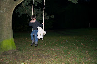
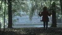 In terms of developing existing conventions of real media, we have used various methods to carry this out. For example, the simple convention of a teaser trailer is to tease, ultimately enticing the viewer in so that they want to watch your film, whilst not revealing too much of the narrative. We aimed to entice the viewer by showing a kidnap and then the return, which touches on the possession genre. In terms of inspiration, the direct link between the swing shot in the trailer for the Omen and the same in our own trailer is very clear. We noticed that in many of the films that we were inspired by; almost all of them used a swing shot involving a young child.
 Another of our main sources of inspiration came in the shape of various case studies. The most influential of which were news stories such as the disappearance of Madeline McCann and other young children such as James Bulger who was particularly interesting case because it also incorporated young children committing twisted acts. An alternative inspiration behind our trailer came from looking into possession and related incidents such as Jaycee Lee Dugard who suffered from the intriguing issue Stockholm Syndrome. This provided an alternative logical reason behind Harvey’s behaviour as opposed to the pathological, demonic explanation which is the strong suggestion of the trailer. However, having gained a deeper insight into the ideas of demonic possession in the real world, we found that demons tend to enter after an individual has been through a traumatic experience, which in this case is of course the kidnapping itself. In a broader sense, we have taken the general idea of a possessed child in a film and developed it further by creating an event in which the possession occurs. This challenges the ideas of possession in traditional films such as The Omen, where the child is evil from birth.
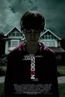 More specifically, we took direct inspiration from the Insidious poster, where the boys eyes have been altered to look more evil and this can also be seen in our poster, with the red rings around Harvey’s pupils, which we also edited to be dark and mysterious. In more detail, the colour itself is traditionally viewed as evil and the eye is a powerful physical human feature, often described as a ‘window to the soul’ and it is evident that Harvey’s soul is not quite as innocent as he first seems.
 Our location was interesting as towards the beginning we tried to create a homely feel, which was mostly present in our trailer when we used a ‘home video’ type effect in places such as a garden and living room. This suggests safety and security, which is opposed when the shots are then expanded to a lonely field where Harvey is alone on a swing beneath the tree and ultimately leaving him vulnerable. After he is taken we see the swing gently swaying, and the teddy bear left behind is an indication of the innocence he has lost and the childhood he has left behind. Following the kidnap, are scenes which show a knife falling top the ground and Harvey digging a grave, both of which are in dirty environments and are further indications of him losing his cleanliness and purity. This has challenged certain forms of media conventions, as we have therefore taken the innocence away from the child which is traditionally one of their redeeming features. He is now seen committing acts that are not normally associated with young children and both fairly morbid ideas. Towards the end of the trailer, as Harvey returns home but there is obviously a substantial difference in his behaviour, such as aggressively drawing dead people and directing a sinister look over his mother’s shoulder. This follows the theory of Propp, particularly the final stages where the protagonist returns, with a slight alteration regarding the balance of power.
  With regard to sound, our trailer begins with a slow paced, calm version of ‘happy birthday’ which accompanies the shots of Harvey blowing out candles at home, giving a family-orientated atmosphere and emphasising security. However, this comes to an abrupt end as we see Harvey alone on a swing and a deep, eerie drone begins, coupled with a spooky rendition of the nursery rhyme ‘teddy bear’s picnic’ which follows conventions of real media as it’s associated with children. This said, we also challenge them as it does not sound innocent, much like the path Harvey has taken. Lyrically, the nursery rhyme also carries strong relevance to our trailer, with lines such as ‘if you go down to the woods today, you’re sure of a big surprise’ which is ultimately what the young protagonist experiences. Following this, the nursery rhyme comes to an abrupt halt as the shot of an empty swing comes up, indicating that Harvey has been taken, along with his innocence, which is left by the swing, symbolically in the form of the teddy bear. The dull drone continues after this, ensuring the audience’s attention is drawn to the shocking images rather than the sound and also adds further impetus to the loud noise at the end, as Harvey looks up which intends to surprise.
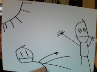
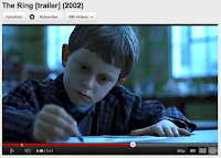 Editing has also played a pivotal role in establishing the conventions of our trailer and we have used many methods to do so. Initially, we used several fade to white transitions, in order to emphasise the fact that the events were from the past, and in addition to this we used a home video effect to further the realistic feel we were aiming for and thus enabling people to relate more easily to the situation and become immersed in the film. Linked to this is the crackling effect we have used in some transitional cases, this helps add to the voyeuristic nature, indicating that Harvey has been watched for some time. Overall, in terms of editing, we largely followed existing media conventions such as using straight cuts to increase the pace and make it seem more like a genuine teaser trailer, as well as using match on action later on in the scene where Harvey is drawing, in order to maintain continuity. The drawing scene itself takes obvious ideas from the similar scene in The Ring where a young boy is shown creating morbid pictures in a strange manner. Also, we used the typewriter effect a to give the feel of a police case, thus suggesting that some kind of crime has been committed with the clicking sound and font combining to good effect. We discovered that many other films within the same genre have also used text to give information to the audience, because we wanted to use a police case study, we thought this would look good in our trailer.
 We picked the spooky looking Warner Bros ident alongside the Dark Castle logo as we felt these fitted our genre most efficiently and we had also looked into films such as Orphan which had previously used them as well as being closely linked to our own.
we also used Todorov's theory of narrative, both conforming and challenging this...
Tzvetan Todorov’s Theory of Narrative
Todorov suggested that conventional narratives are structured in five stages:
1. a state of equilibrium at the outset;
2. a disruption of the equilibrium by some action;
3. a recognition that there has been a disruption;
4. an attempt to repair the disruption;
5. a reinstatement of the equilibrium
This is the most common form of Narrative theory that is found within films.
Labels:
Evaluation Question 1
Friday, 23 March 2012
Todorovs Theory
Tzvetan Todorov’s Theory of Narrative
Todorov suggested that conventional narratives are structured in five stages:
1. a state of equilibrium at the outset;
2. a disruption of the equilibrium by some action;
3. a recognition that there has been a disruption;
4. an attempt to repair the disruption;
5. a reinstatement of the equilibrium
This is the most common form of Narrative theory that is found within films.
We have both followed and challenged
Our Title

We eventually changed our font again to a basic 'times new roman' this was because we were unsure on the typewriter font. we then decided to change the 'o' in the title to a larger size with the cross in the middle. this was not only for effect but the font of the 'o' symbolises child like handwriting and the cross within the 'o' symbolises religion which is most often associated with possession.
Labels:
font,
handwriting,
Planning,
Possession,
religion,
Research
Producing Companies
We decided that our two producing companies for our teaser trailer would be Warner Bros. Pictures and Dark Castle Entertainment. We chose these production companies as they have worked on the 'Orphan' and this was one of our inspirations for our film trailer.
Subscribe to:
Comments (Atom)


